

For over 40 years, TowHaul has been dedicated to designing and manufacturing the most reliable, efficient and adaptable off-road equipment in the mining industry. TowHaul initially came to Hardy for a brochure design. After the success of the brochure, it opened company leaders’ eyes to the potential of branding and how it could better help the company reach its goals. Utilizing the brand work we completed when designing the brochure, we expanded it into a system that would work across all aspects of the company, including a new user-focused website.
Brand Strategy
Brand Identity
Branded Brochure
Business Set
Website
Illustration
Photography
Copywriting
Belgrade, Montana
After more than 40 years of piece-mealing marketing assets together, TowHaul now has a website and the brand assets and direction to communicate the value of their products.


An outdated website and brand identity were not clearly communicating TowHaul’s focus on innovation and the value of its products.
To position TowHaul in its market as an industry leader that designs and manufactures the most reliable, efficient and adaptable off-road equipment in the mining industry.
Harness the grittiness, heritage and hardworking elements of the TowHaul brand and communicate them through textures and imagery. Design a website that is as innovative and user-focused as TowHaul’s equipment.



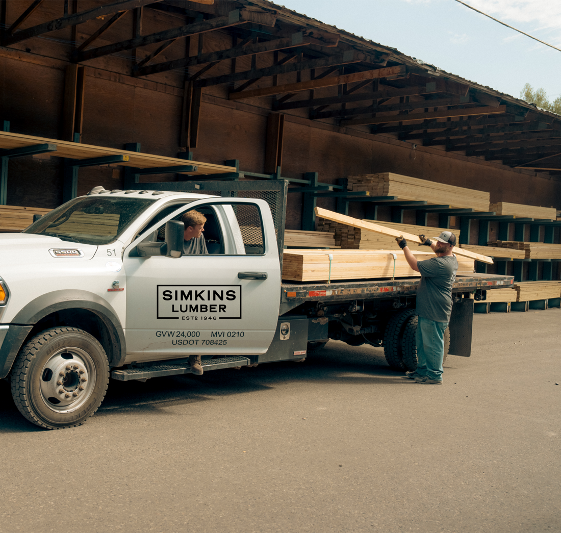
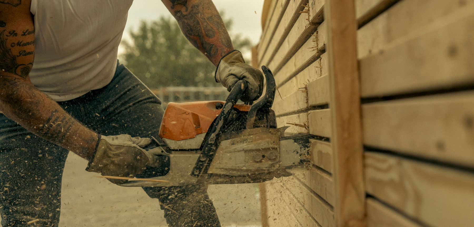
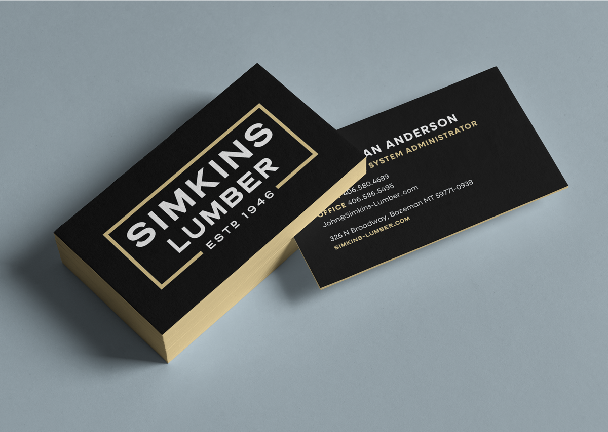

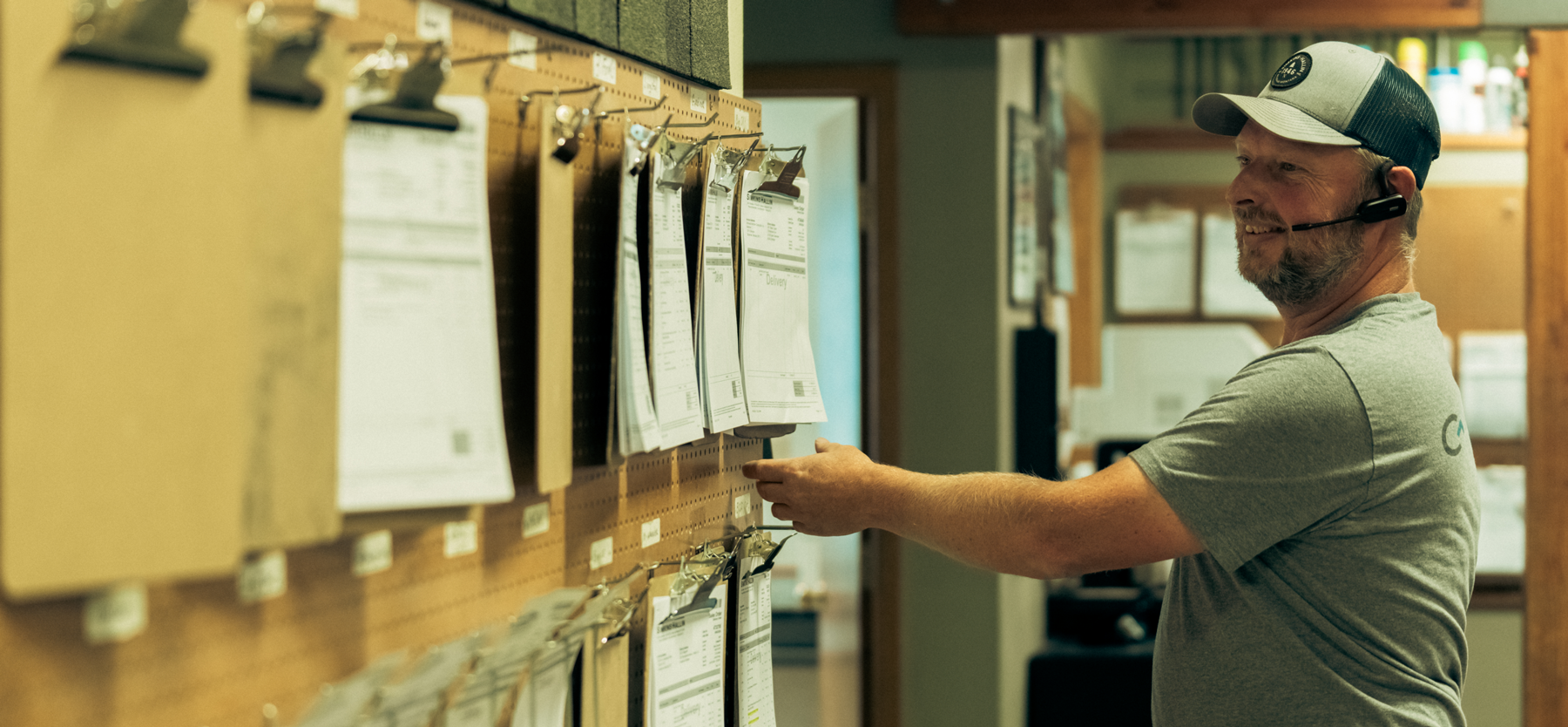
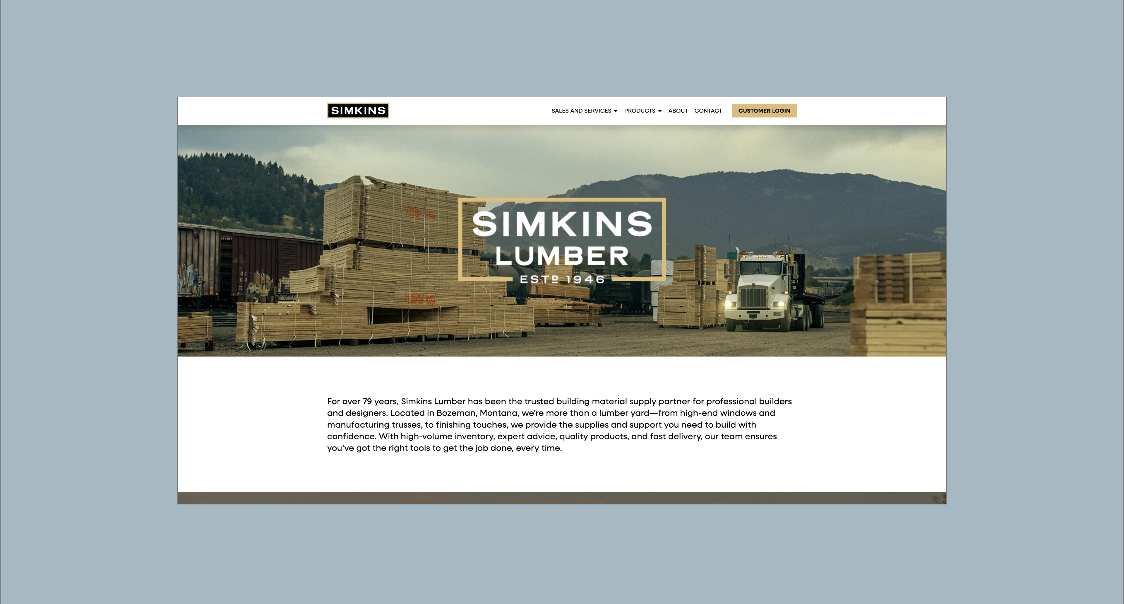
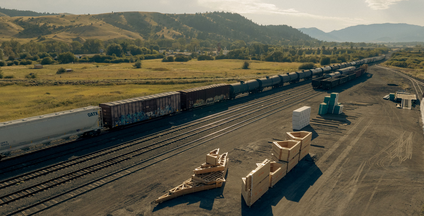


Hardy facilitated a multi-phase brand launch that considered everything from employee-owner training to the ‘why pay more’ signs. The first step was to train all leadership staff on the new strategy. By providing consistent language, their leadership team has the tools to communicate the brand to all employee-owners and customers, utilize it in hiring, and lean on it for business decisions. To support the high level of service T&C is known for, we created talking points, rack cards, and tools that empower employee-owners to answer questions customers may have.


The Bridger Brewing team wanted to be prepared to can and distribute its beer after opening its second location. AMS partnered with Bridger Brewing for packaging design concepts. The first step in the packaging process involved a strategy session in which the unique identity of each beer was explored and dissected. Several concepts were then sketched out. Once a concept was selected for each beer, custom illustrations were created for cans and boxes. The result is a full lineup of beers, each with its own design that is unique while still clearly a member of the Bridger Brewing brand.


The longest line you’ll see comes from a reel.
Big ideas are best discussed on the back of a pickup.


“Thank you to you and your team for tackling our project and doing the great work you do! We are happy customers.”


