

Based in Lewistown, Montana, Spika Design & Manufacturing develops custom access platforms to help the world’s most innovative companies tackle their toughest challenges. The Spika team helps their partners push boundaries in space, the sky, and here on Earth. When it comes to engineered tailored solutions for safe access in industries like aerospace, aviation, and defense, Spika’s team is there to help.
Our team worked with Spika to develop a brand that balances its innovative nature with its Montana family-owned values of hard work and integrity. Their cultural ethos is represented throughout their brand, especially in their logo with its dynamic upwards step, with each slat representing a Spika platform’s ability to reach new heights, both practically and metaphorically.
In a competitive global market, Spika needed a website that would reach international partners, accommodate future growth, and operate as an impactful sales tool. We worked with their team to develop a website that highlights their capabilities and culture, establishes credibility, and supports sales
Spika Design & Manufacturing now has a strategically positioned brand and optimized website that will help them achieve their goals. Check out their rebrand below.
Brand Strategy
Brand Identity
Logo Update
Website Design & Development
Lewistown, MT
Spika Design and Manufacturing’s brand and website now sets them apart in their global industry, validate their existing reputation and communicate the integrity of their small-town Montana roots.



As a company based in a small Montana town that works with partners across the globe, Spika needed a brand that communicated its strong ability to create safe, elegant custom access solutions.
Develop a brand and website that strengthens its existing reputation as a trusted partner for the world’s most innovative organizations.
Uniting their strategy with aspirational visual language, to communicate Spika’s belief that nothing is out of reach. Develop a website that speaks to all their capabilities and feels as authentic and innovative as the Spika team.






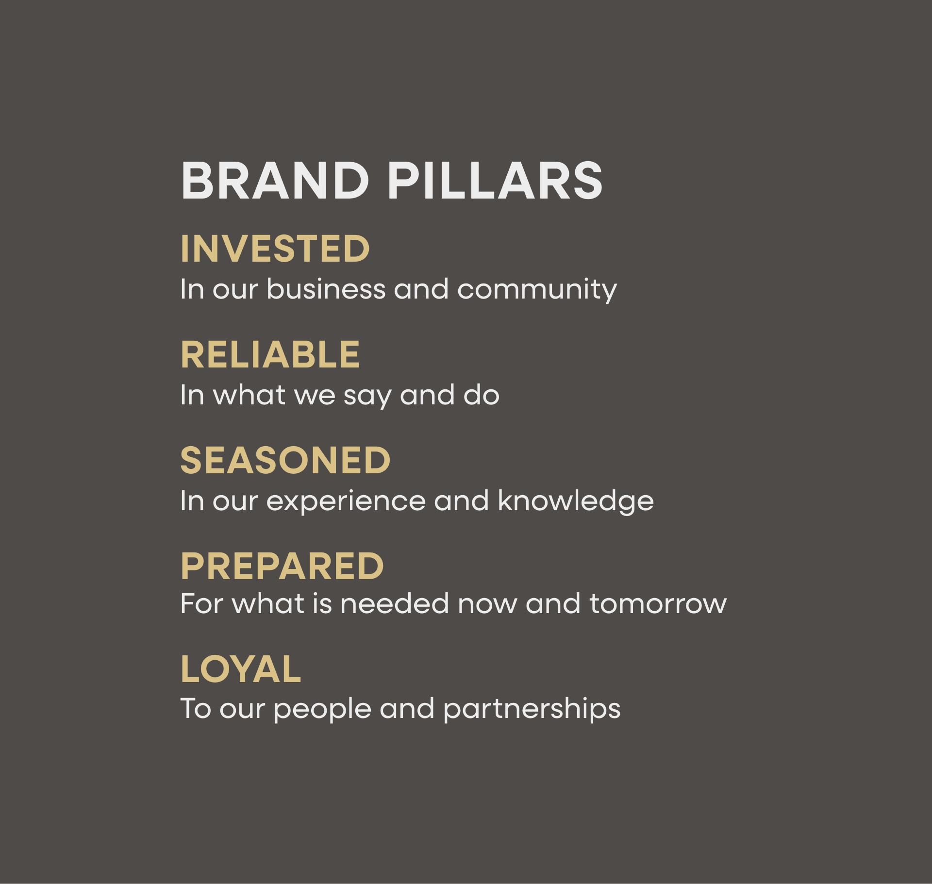


Hardy facilitated a multi-phase brand launch that considered everything from employee-owner training to the ‘why pay more’ signs. The first step was to train all leadership staff on the new strategy. By providing consistent language, their leadership team has the tools to communicate the brand to all employee-owners and customers, utilize it in hiring, and lean on it for business decisions. To support the high level of service T&C is known for, we created talking points, rack cards, and tools that empower employee-owners to answer questions customers may have.


The Bridger Brewing team wanted to be prepared to can and distribute its beer after opening its second location. AMS partnered with Bridger Brewing for packaging design concepts. The first step in the packaging process involved a strategy session in which the unique identity of each beer was explored and dissected. Several concepts were then sketched out. Once a concept was selected for each beer, custom illustrations were created for cans and boxes. The result is a full lineup of beers, each with its own design that is unique while still clearly a member of the Bridger Brewing brand.


The longest line you’ll see comes from a reel.
Big ideas are best discussed on the back of a pickup.


“After being in business for over 20 years, we were struggling to organize and present our values and vision for the future successfully to both our team members and partners. Hardy Brands spent many hours asking fundamental questions about what makes Spika, Spika and helped us uncover the authentic story that captured our core and represented our vision. The new brand colors and logo that emerged from this rebrand work communicate our values and vision much better than before. After years of trying to represent our brand successfully, Hardy’s work established an authentic brand that we can build on for many years into our future.”


